In terms of production I want to create a process chain of thumbnail through digital painting and ending up with a fully textured and lit CG model
A large amount of research has gone into this project through various documentaries about numerous ancient cultures such as the Aztec’s and the Sumerian’s as well as other such civilizations. I have also looked at other artist’s interpretations of Lovecraft’s Old one’s ancient ruined city as well as interpretations of the long forgotten inhabitants of the city.
With this research backing me I decided to create the city in a Megalithic type of style heavily influenced by the overwhelming impossibility of moving and setting the gigantic blocks in place with which the city has been created.
The environment I felt had to be ancient in appearance in terms of architectural style but also have a mysterious defying look, more alien and unthinkable than the likes of Stonehenge and such other Megalithic monuments, to back the idea that the Old Ones Lovecraft tells of came from the stars.
As oppose to going through the story briefly in words I find it far more interesting to watch a clip, as as they say ‘a picture speaks a 1000 words’ So this should be more entertaining than reading a summary of the story. However bare in mind the person who has made this has their own view on the story as well as a limited arsenal of pictures which fit the story by the looks of it and as a result their interpretation of the city differs from my own.
Here’s a summary of the story:
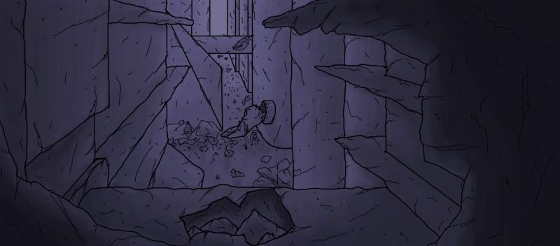
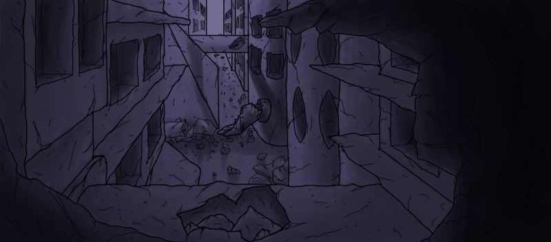
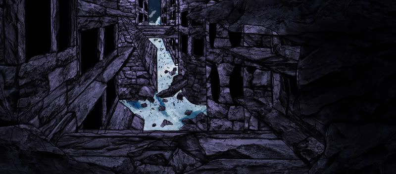
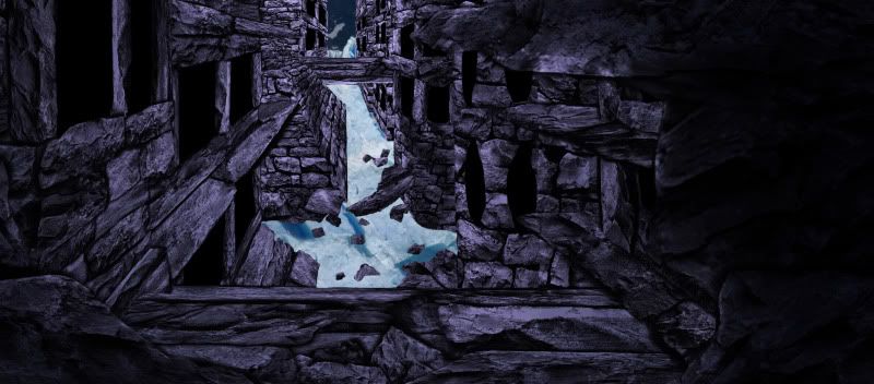
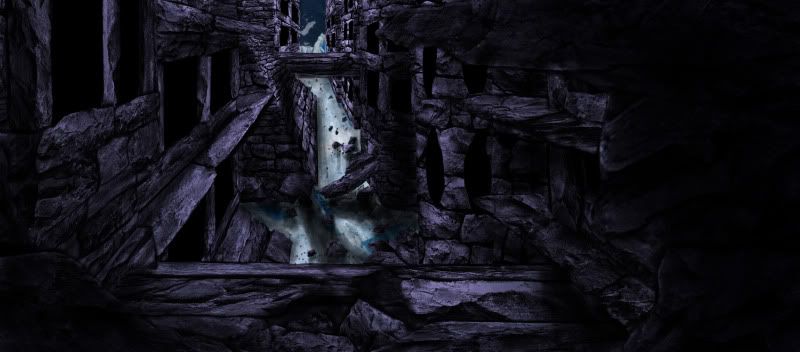
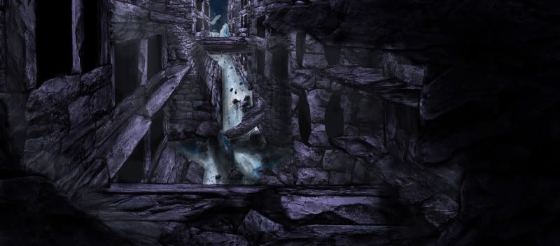
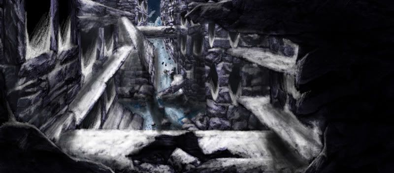
After extensive research and a large amount of time conceiving my idea and experimenting through various drawings as well as learning to digitally paint pictures inspired by the work of Feng Zhu. I came up with the following 3 scenes with which I set about creating in Maya.
View across the city
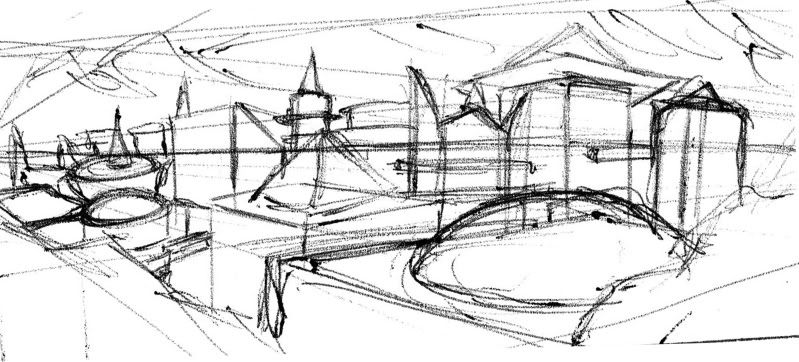
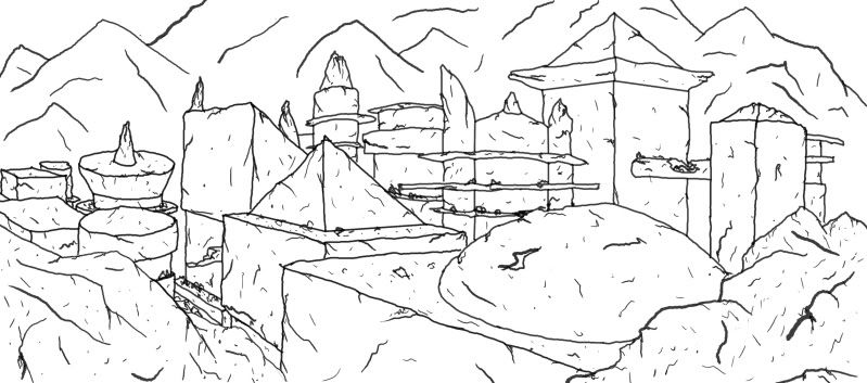
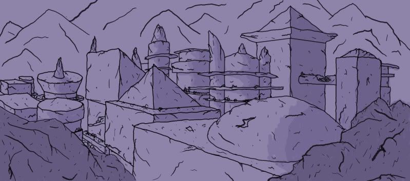
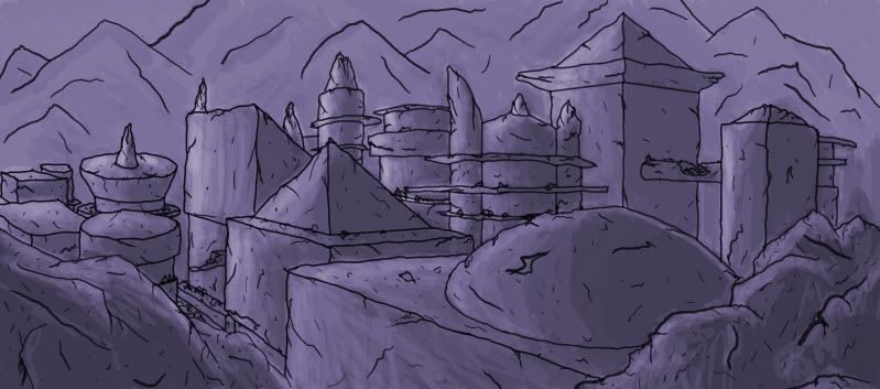
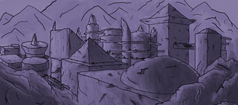
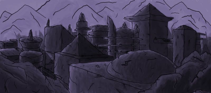
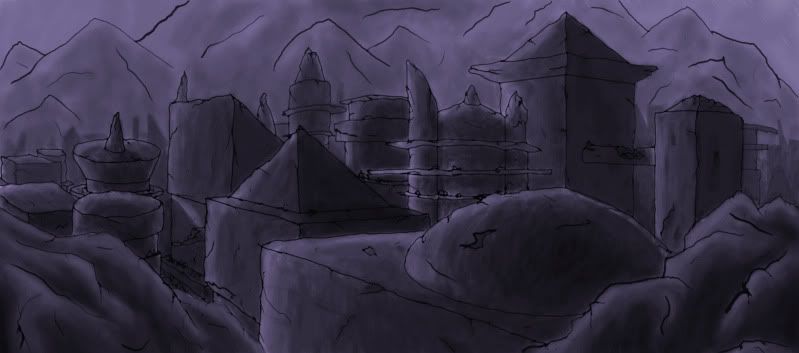
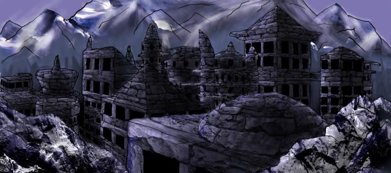
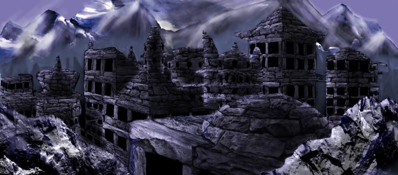
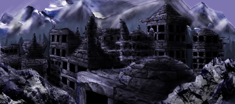
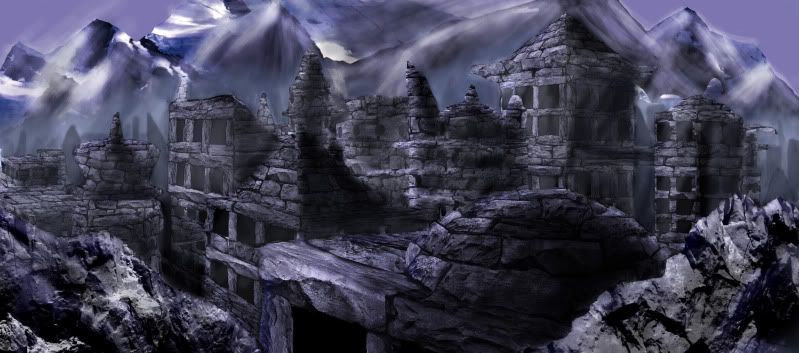
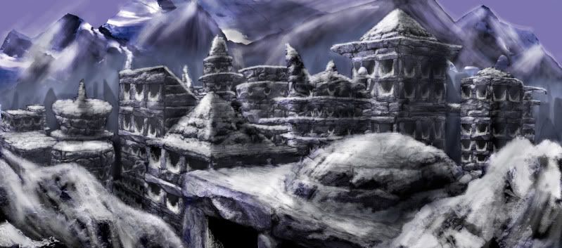
Inner City
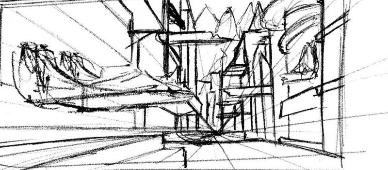
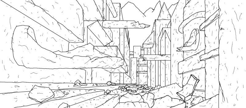
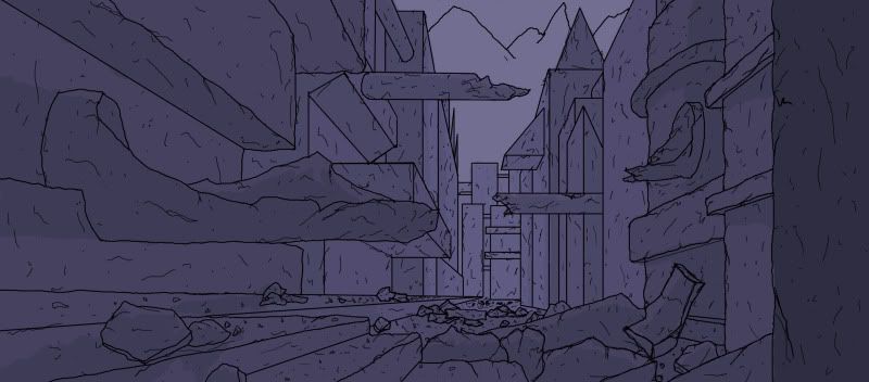
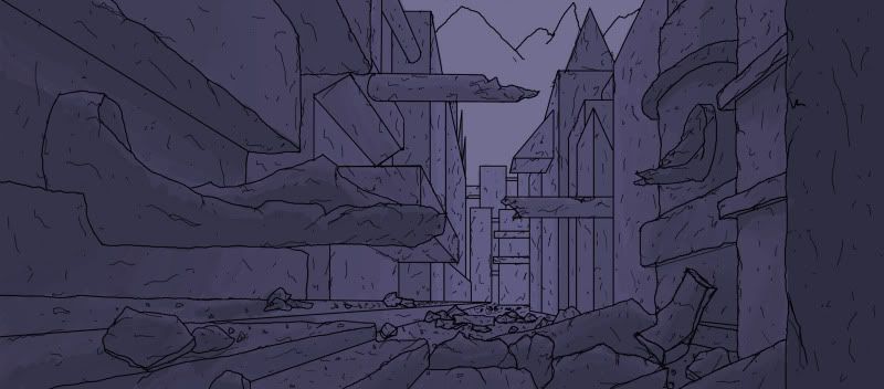
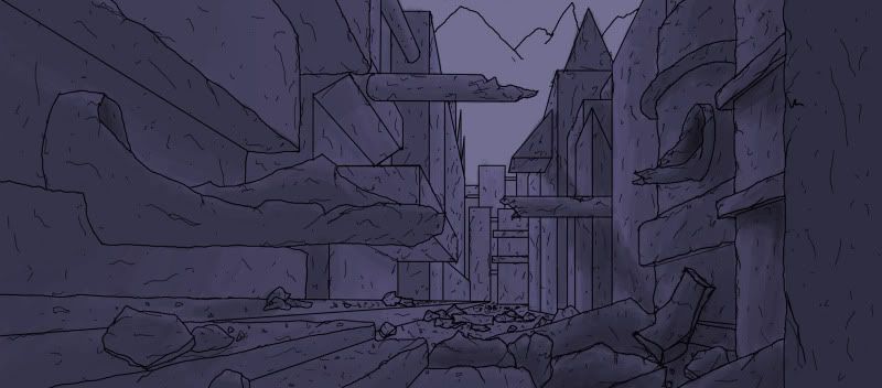
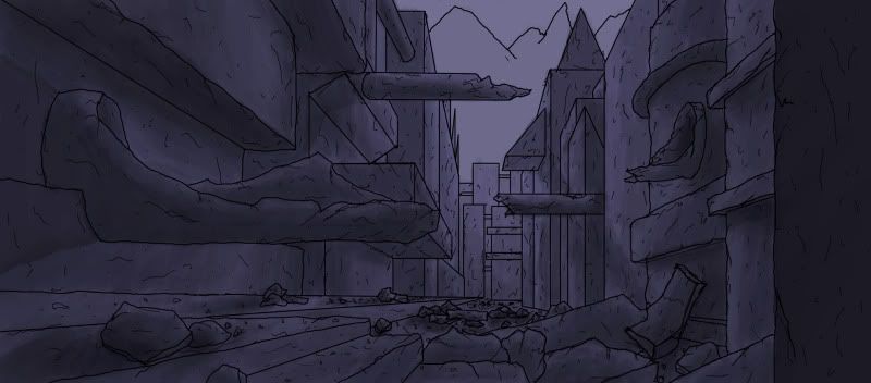
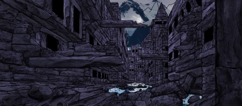
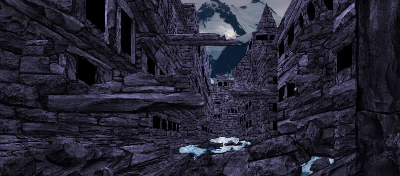
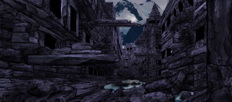
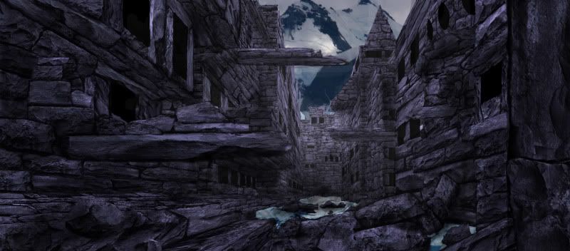
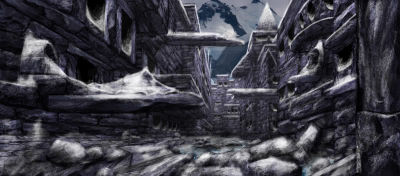
View from within
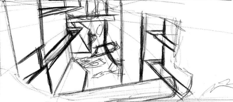
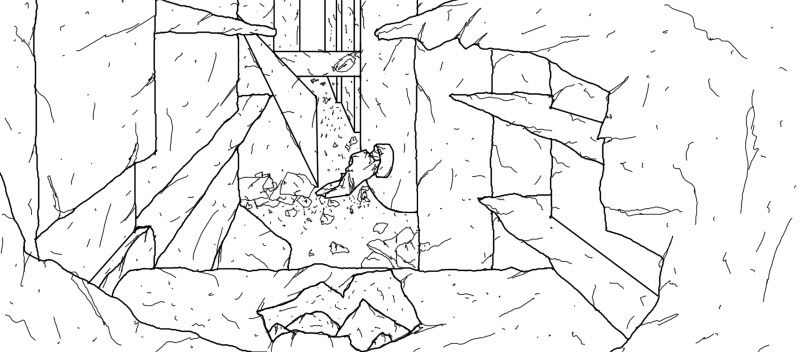
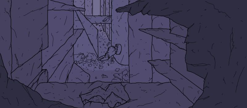
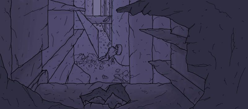
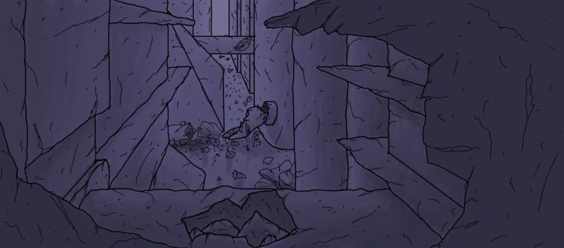
------------
-----------
--------
From this point I went about creating a basic polygon model as well as created 3 camera’s and assigned my digital paintings to them as a background to enable me to be fairly accurate and sync up with my paintings.
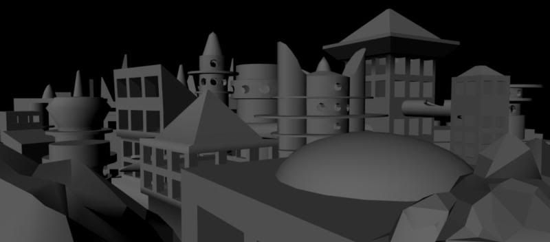
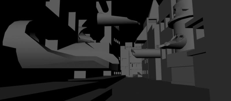
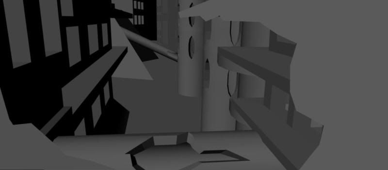
After creating these basic models I set up my cameras with a path through the buildings into the paintings as such then from there began to model into and texture all the buildings.
The Process was long and I began by modelling the first buildings entirely in detail so that I would have a resource to borrow from there for saving time and effort modelling ever single building in a process known as ‘Kit bashing’ which basically means recycling models, re-using, altering and re-aligning to make new models.
Where I began re-using my models the time and effort was dramatically reduced despite still being a long arduous process, laying out UV’s is by no means a quick job on complex shapes but was the quickest part of the process, modelling varied between buildings as I could re-use part of buildings where as others had to be completely modelled to fit in. The texturing was very time consuming as to give the city a realistic feel I didn’t want to just take a brick texture and cover the building it needed to fit with the architecture in terms of supporting the weight above and look convincing.
I used a brick texture from http://www.cgtextures.com/ and modified it to suit my work, along with this I cut out each individual brick in Photoshop so I could copy and paste them as I needed them therefore giving me a more random texture and no so much prepetition in the texture.
I had already made decisions about how the bridges would be supported while digital painting and overlaying textures in Photoshop. I decided that for this place be believable with all the bridges they would need to be massive stone slabs suspended by the sheer weight pressing down on them from above. To further the realism in the piece I used bump to give my textures more of a presence and specular maps to give mimic the way in which light catches areas of objects that appear more metallic therefore giving the city more of a gritty texture and make the city seem more in ruin.
Texture map
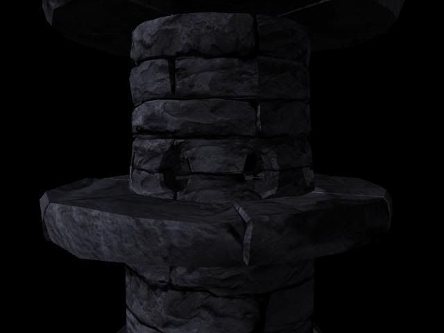
Bump map
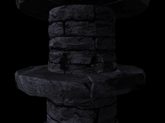
Spec map
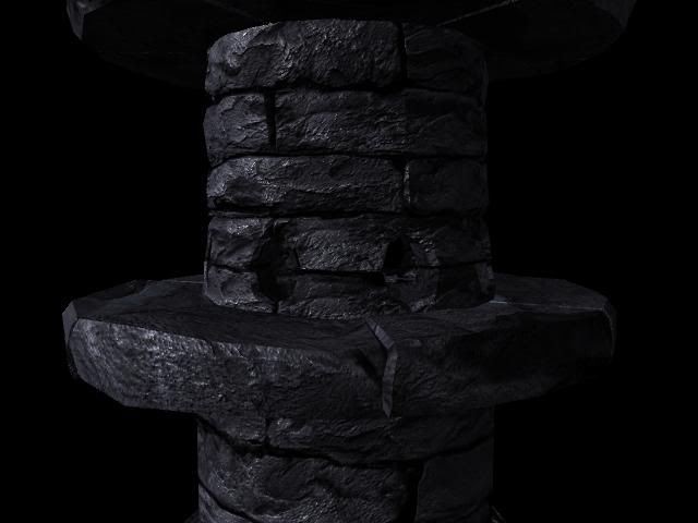
With my textures coming along nicely and my city taking shape I decided it was time to set up the ‘Mountains of Madness’ themselves. I did this by compositing a number or photographs together in a line then simply lined each edge up so the mountains made one continuous mountain range like a 360 degree panorama.
The mountain range was created from 5 different photographs
*Referance*
mi9.com – Datawallpapers
www.mountainwallpaper.info - Mountain-27143
Snowy Mountain - Denis Ayres
www.mountainwallpaper.info - Mountain-54015
aaronnuca.files.wordpress.com-2009-01-mountains_snow20001
Composited Image:
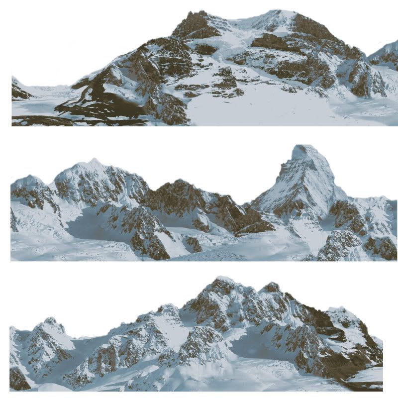
I had a number of problems with the mountains as it was difficult to obtain what I wanted colour wise after I lit the scene with Maya Physical Sun, as well as the fact that a ring appeared on the top of the cylinder that had my texture and transparency overlaid on it.
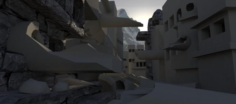
Maya software renders of the city at that stage at the beginning and end of each camera move:
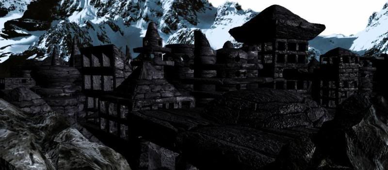
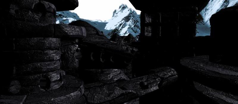
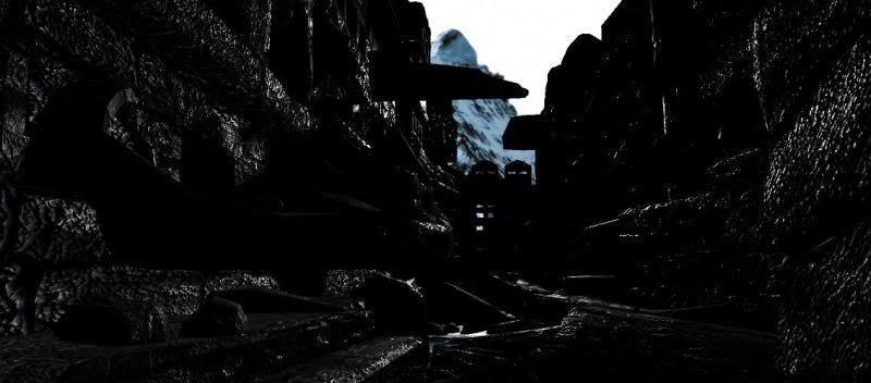

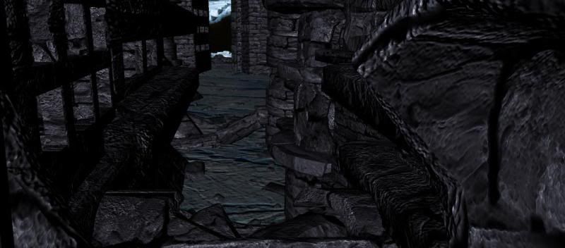
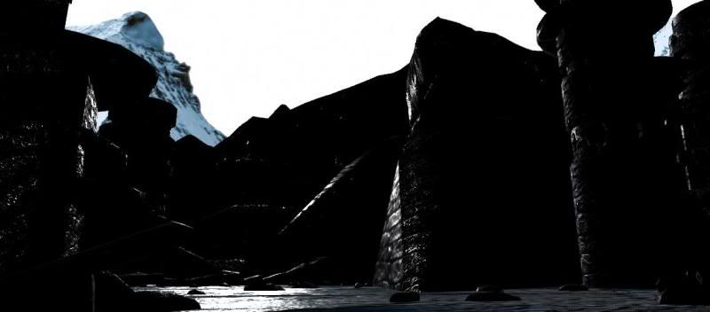
There are a few more Maya software renders of the city (Baring in mind the city was modelled for the camera, so there are edges that don’t match up in some pictures):
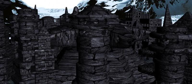
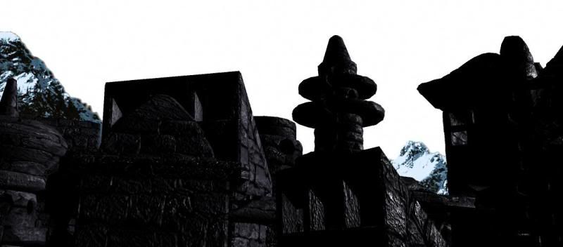
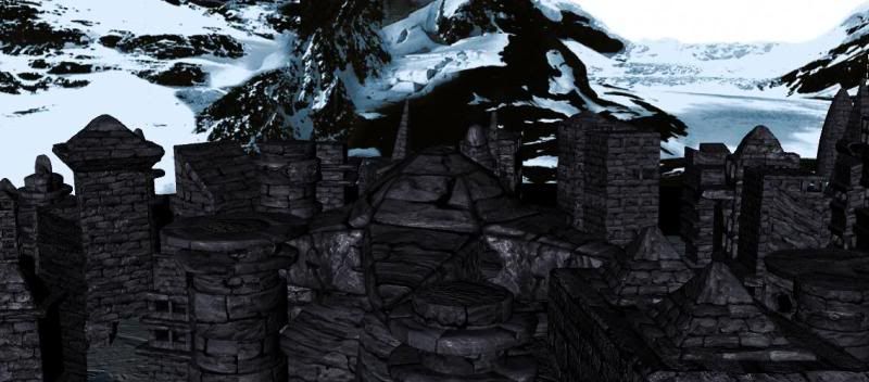
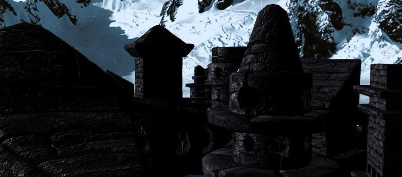
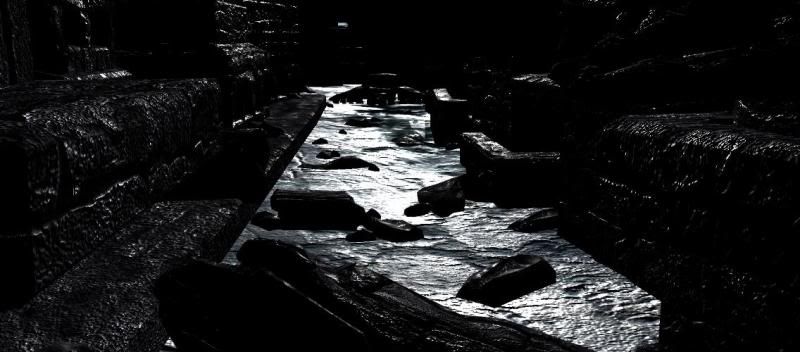
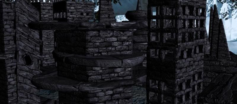
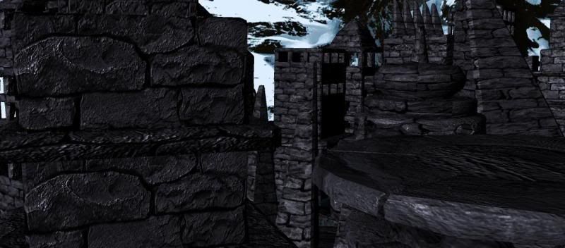
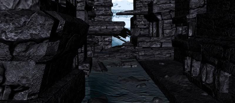
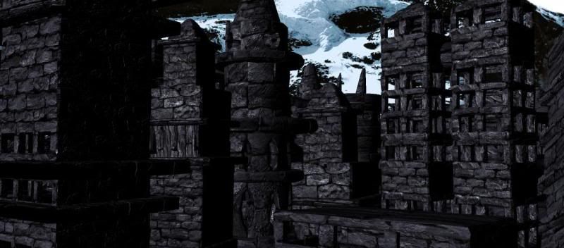
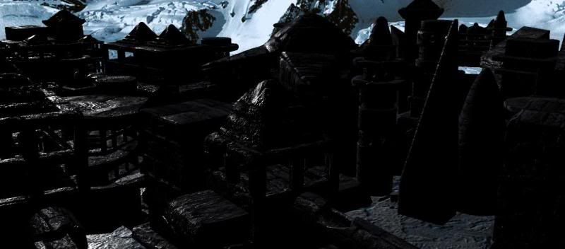
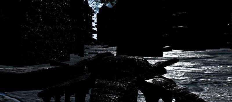
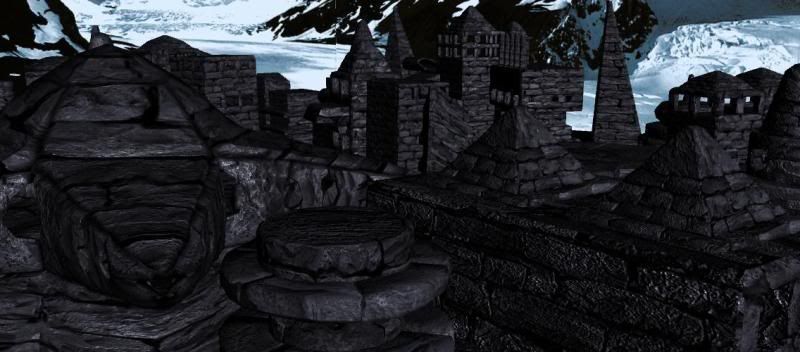
Lighting wise as I mentioned, above I used the Maya Physical Sun to emulate a real world sky as well as to light the city from a single point like the sun would.
Here’s a few close ups of a couple of the textured buildings rendered out in Mental Ray using Maya Physical Sky/Sun to light the scene.
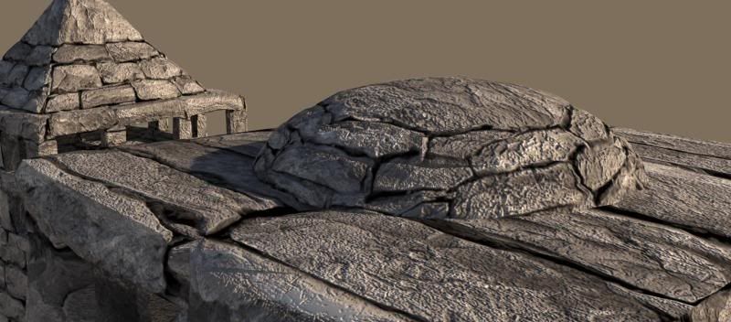
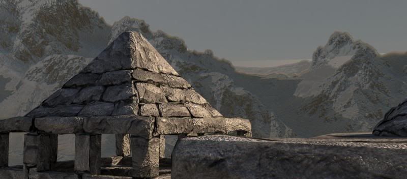
Tweeking the settings of Maya Physical Sky/Sun to give a fairly neutral light as oppose to giving the scene a cold or hot look to it as this neutral light I felt intensified the desolateness of the piece.
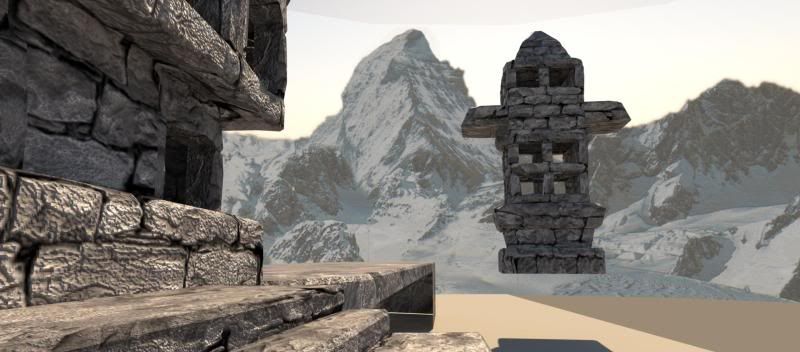
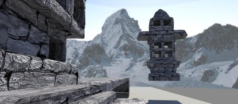
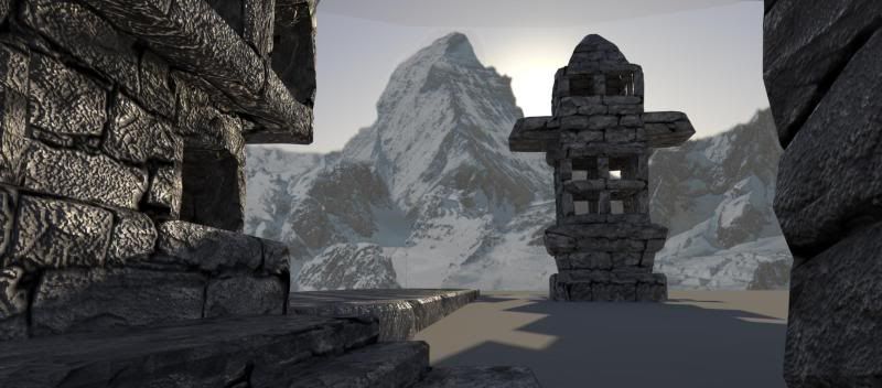
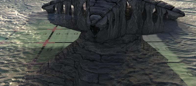
Once all the buildings were textured I set about creating the ice floor to the scene again using another texture I’d sourced from http://www.cgtextures.com/ I altered the bump and secular maps to try and give the ice a rather mirrored look but still give transparency in places which I used a transparency map to achieve as well as varying the colour of the ice where the transparency was to give it the appearance of being deep and murky.
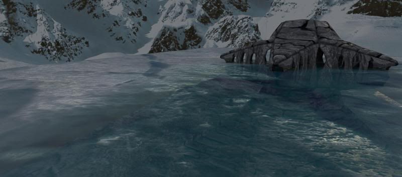
Time was getting closer to the deadline and I made a calculated decision to not persue adding snow to the city as it would have taken a tremendous amount of time due to the reusing of buildings and with them rotated and altered in various ways simply painting onto the texture would have had rather unwanted results such as snow clinging to the bottom of ledges etc. Therefore I decided to keep the city as a desolate megalithic ruin.
Once the scene was completely textured I went about downsizing all the texture maps on the geometry as I intentionally created them at a resolution of 2k just encase I needed to use them close up. After creating a downsized copy of the textures I then assigned all the buildings with the lower 1k textures and followed the cameras path assigning 2k textures where they were needed.
The rendering process didn’t go all that smoothly and I ended up with a number of failed renders due to the size I was working at and in desperation I downsized the texture maps instead of the screen resolution which then left me dissatisfied with my renders so I set out altering my scene file so it would render. Once I had sorted the scene I set up batch renders for a master beauty pass as well as an ambient occlusion pass and further more a shadow pass.
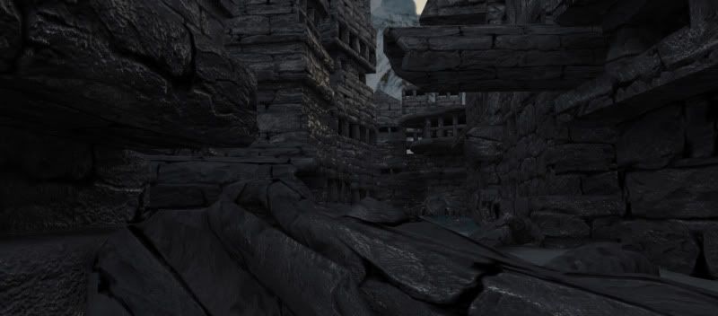
The first beauty pass I created was on scene 2 but towards the end of the render I realised that there was a gap in my scene where one of the buildings had moved upwards from its original position and due to me turning off the layers with a large number of the buildings not seen in shot, the hole was illuminated and plain to see so began re-rendering that pass and from there on rendering went relatively smoothly other than the Maya licence going down on the computers therefore leaving me twiddling my thumbs while I wait to finish off rendering.
Hole in scene2:
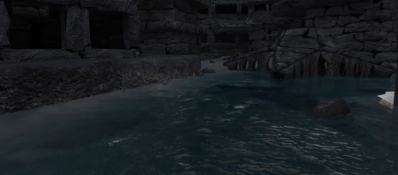
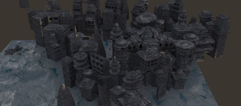
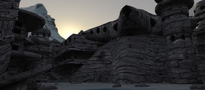
Post Render shots of the city:
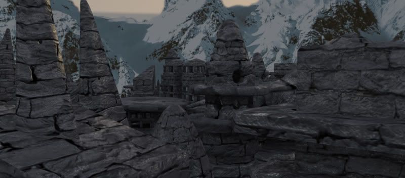
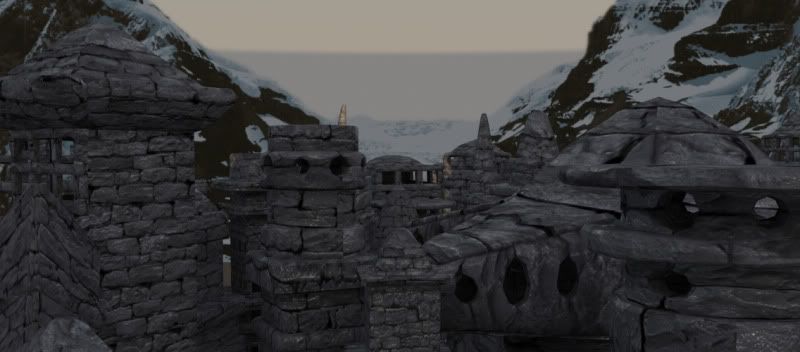
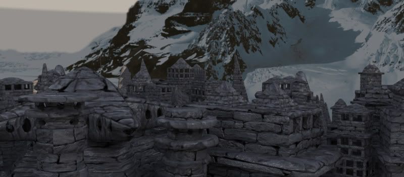
One problem which I came across only once rendering was done was that the light being emmited from Maya Physical Sun was being blocked by my mountains as due to a solid line appearing above the transparency on the mountains which I found at an earlier point was making my scene look amateurish although my best efforts wouldn’t remove it so i decided to lay out extrude the top edge up and UV’s map the UV’s of the visable top edge with transparency. Although this now leads me to find out I’ve blocked most of my light from the first scene leaving me with a rather dark city.
However this is only apparent in the first scene as the second and third are down in the shadows anyway so the composition has not changed much due to the lack of light.
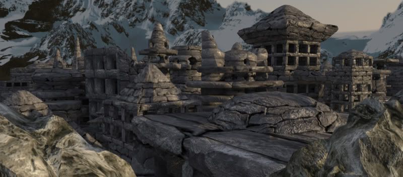
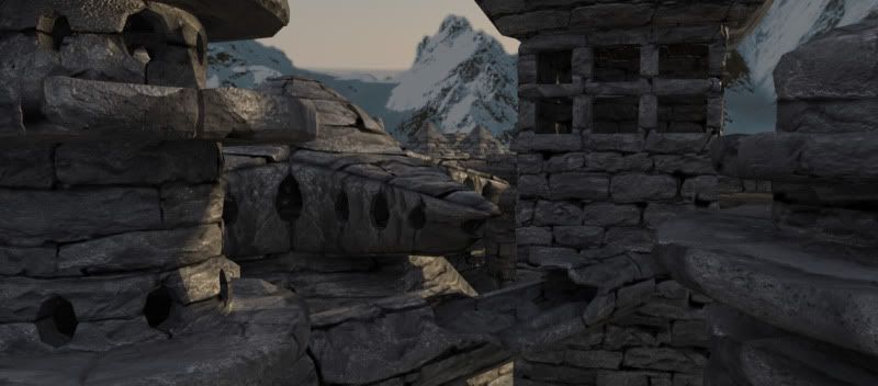
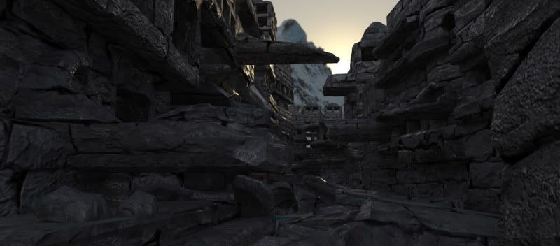
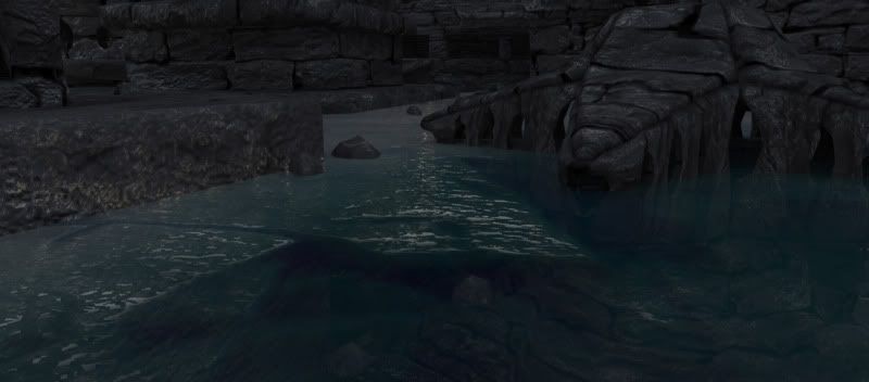
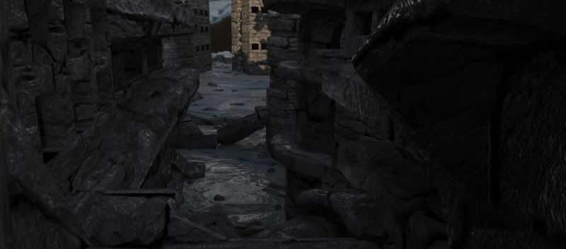
From here down are a few shots of the altered lighting as it should have been which is sadly not present in the final render:
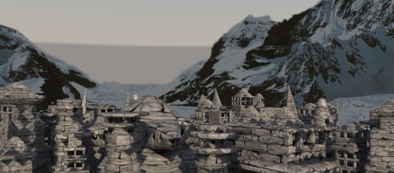
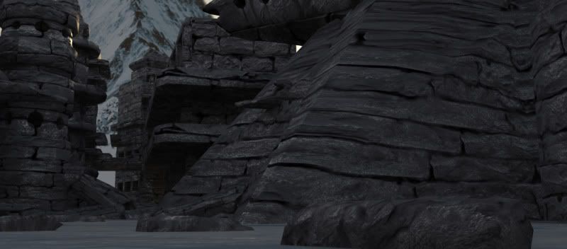
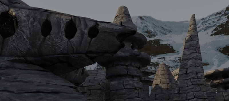
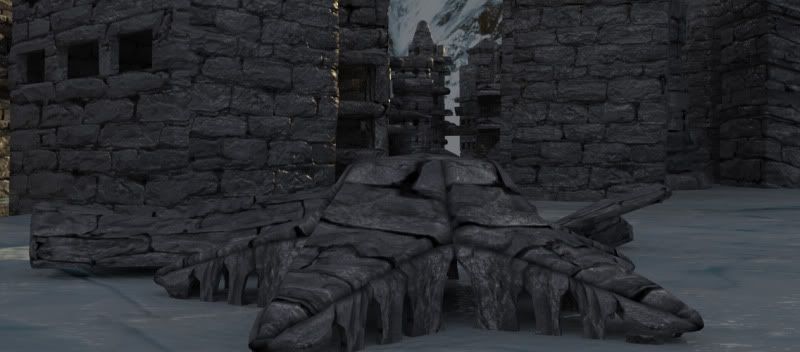
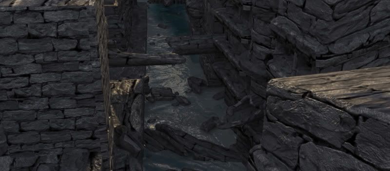
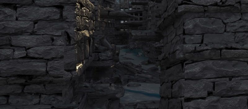
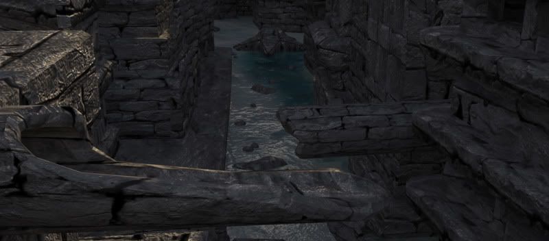
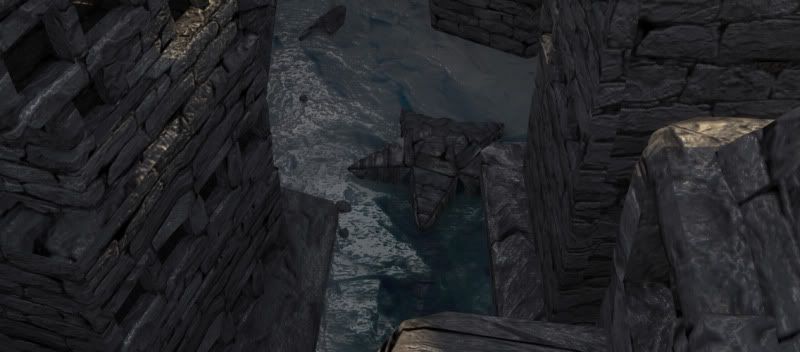
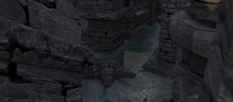
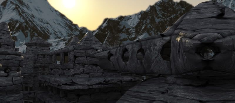
Here’s a number of renders of the first and last frame of each scene with the lighting link broken between the light and the mountains
*Just realised didn't acredit the music on the actually video...
So the music is: Vangelis - Rachel's Song*

1 comment:
Your first follower, woo! :D
Post a Comment